Microsoft Word 2016 for Mac after a month
Microsoft took five years to update Mac: Office 2011.
Mac Office:2011 was almost a generation behind the Windows version of Office at launch. It didn’t just look out-of-date, it was missing functionality.
At best Microsoft was paying lip-service to Mac users. It left a vacuum for others to fill. This includes Apple with its iWorks suite.
Office for Mac 2016 beta
Judging by the Office for Mac 2016 beta, that’s changed. I’ve used it for a month and I’m impressed.
Although I’ve looked briefly at the new versions of Excel, PowerPoint, OneNote and Outlook, from this point on I’m going to stop writing about Office and focus on Word 2016.
The changes in the new version are obvious from the software loads. Mac Word:2011 had a messy, confusing user interface. It left the Mac user making weird cognitive jumps between the familiar OS X world and a faux Windows interface.
Beyond ugly
It was ugly to look at. This isn’t simply about aesthetics. Ugly can be productive. Mac Word:2011 was ugly in a distracting way. I found I needed to jump through hoops to get as much of the user interface out of my face before I could think about putting words on the screen.
Microsoft Word 2016 for Mac is clean. It isn’t minimal, but the screen furniture left behind stays out of your way.
There are still two menus. The OS X menu you get with almost every Mac app shows at the top of the screen, while a second menu sits just about the Windows-style ribbon interface.
The key is that you no longer find yourself jumping between two disconnected worlds. Microsoft Word for Mac actually feels like a Mac app, not a Windows app recompiled and shoe-horned into a different OS.
OneDrive integration
Microsoft has made huge strides with its cloud services in recent years. OneDrive is now central to Office.
The new OS X version of Word integrates nicely with OneDrive.
Most Mac apps run into a problem when saving documents. The save dialogue provides a list of folders, but it only includes favourites and recent. That’s difficult if you need to store a document somewhere that’s neither a favorite nor a recent folder.
The new Word save dialogue has the usual OS X elements, but adds an online button and allows you to navigate through your OneDrive folders to find the best resting place for your document.
Microsoft has also made it easier to share documents and to collaborate with others. Microsoft collaboration isn’t real-time like Google Docs where you can watch others edit. Instead you get notifications of changes after saving a document.
This may work for some users, but I find the Google approach works best when, say, a handful of editors are racing to get a story online.
A big step forward
Microsoft Word 2016 for Mac is still a beta. That can mean risky. So far I haven’t seen any instability or serious bugs. Nor have I seen any obvious performance problems. The code runs fine on my MacBook Air.

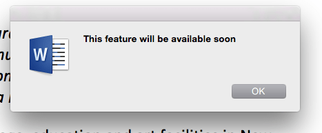
There are missing features. I often see a “this feature will be available soon” message.
Microsoft has made huge strides in the last year or so to focus on building great apps. The iOS Office apps are first rate. Microsoft’s web Office apps are a great way to get out of a hole when you only have a browser to hand.
Member discussion