Why Westpac’s new online bank looks like iOS 7

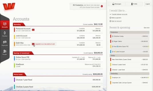
Westpac’s new cross-device online banking site has a modern, stripped-back feel. It treats us like adults.
It has a sophisticated, european look. Lots of white space. Spare easy to read type with lots of room to breath. Simple design elements. It’s visually flat. There’s an emphasis on colour and typography. Icons are minimal.
Putting aside for one moment the bank’s signature bright red livery, the colours are muted. Things don’t shout or scream. It’s a long way from the Fisher-Price inspired designs of a decade ago that characterised the Windows XP era.
iPhone vibe
While it is different enough to avoid infringing any intellectual property rights, it manages to remind me of iOS 7.
So, being a blunt journalist, I asked Westpac design manager Brendan Marshall the obvious question: “Was it inspired by iOS 7?”
Marshall laughed at first. Presumably because he understood exactly what I was getting at. But his answer was no, well, a sort-of ‘no’.
Spare user interfaces all the rage
The point is he explained, modern computer user interface design is evolving towards these spare looking interfaces. Apple’s iOS 7 and the Westpac online banking site are part of the same general movement towards simpler, easier to understand and use designs.
It’s a good point, you’ll find similar minimal interfaces on other device; Microsoft’s Windows Phone 8 and the software Samsung overlays on its S4 smartphone are part of the same aesthetic.
Marshall says it’s about a move away from the more elaborate designs of the past.
You can say that again. Gone are the faux wood panelling book libraries, fake green baize gaming tables and address book icons that look like, well, address books.
Member discussion