Sky-Blue M4 MacBook Air review: better, faster and $50 cheaper
| Component | MacBook Air M4 (2025/2026) |
|---|---|
| Processor | Apple M4 (10-core CPU / 10-core GPU) |
| Base RAM | 16GB Unified Memory (Configurable to 32GB) |
| Display | 13.6" Liquid Retina (2560 x 1664), 500 nits |
| External Monitors | Up to 2 external displays (with lid open) |
| Webcam | 12MP Center Stage (with Desk View support) |
| Price (NZD) | From $2000 for a model with 16GB Ram, 256GB storage. |
Basics
Apple sent a review model 2025 M4 13-inch MacBook Air with 16GB of Ram and 512GB of storage. This configuration sells in New Zealand for $2400.
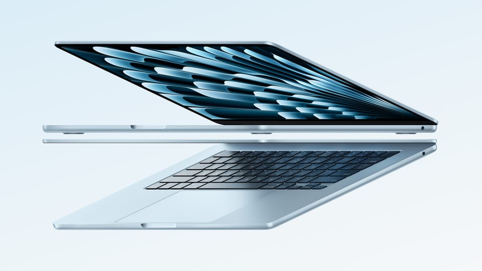
From the outside the laptop would be indistinguishable from the 2024 or 2023 MacBook Airs if it wasn’t for the pale blue metallic case. Apple calls this colour ‘sky blue’: it replaces ‘space grey’.
Otherwise it looks identical to recent MacBook Airs. It’s still thin and light yet solidly built.
This year’s model has the same ports, screen, keyboard and trackpad as recent MacBook Airs. It makes sense, as in these departments there was nothing broken in the earlier design that needed fixing.
Apple doesn’t mess with a formula that works.
Screen nit-picking
The 13-inch MacBook Air’s ‘Liquid Retina’ display is as good as you’ll find anywhere. It has 2560-by-1664 pixels. It makes for crisp looking text and glorious colour images. Photos display well, videos look good.
Apple has kept the screen refresh rate at 60Hz. While Apple’s upscale MacBook Pro model can refresh at 120Hz for a smoother moving picture, for most applications the faster refresh is a nice-to-have feature, not an essential one.
If you plan to play high frame rate games or need to scrub back and forth in a video editing application then it’s worth looking at a MacBook Pro.
Fewer pixels than the MacBook Pro
There’s another noticeable difference. The Air has fewer pixels than the 3024-by-1964 on MacBook Pro display. The Pro’s screen is marginally larger at 14.2 inches compared with 13.6 inches on the Air.
The Air’s screen doesn’t get as bright as the Pro’s. The specification for the Air is 500 nits brightness, while the Pro offers 1000 nits sustained and peaks of 1600 nits.
Words about nits don’t tell the full story. In practice the MacBook Air’s display is bright enough for any application.
This feature had an unusual workout during the review. Halfway through testing this computer I had a cataract operation. Before surgery I needed to crank the screen brightness towards the top of the range to see it clearly. This can drain the battery faster. After the operation I could ease off the brightness.
If the laptop screen is not enough, you can now run two external monitors from the MacBook Air while the computer’s lid is open.

Externals
You’ll struggle to find a better laptop keyboard than the one on the MacBook Air. It feels great. As a journalist I spend most of my week touch-typing. In my experience, the MacBook Air is the best laptop for this kind of work.
You can read more about writing on a Mac in my in-depth look at writing applications.

At the keyboard’s top right is the power button, which doubles as a fingerprint reader for Apple’s Touch ID. As always, it performed flawlessly during testing. It is snappy too, allowing you to log-in immediately. It works when you need to enter passwords online and to confirm payments.
While the best of Apple’s rivals can get close to equalling the keyboard, I’ve yet to find one that can match Apple’s trackpad. It remains the best and, once you are used to it, is fluid and natural in use.
Aside from the MagSafe power connector the outside has two USB-C ports and a headphone jack. Some users quibble about the lack of fancy video ports or an Ethernet connector. I’ve never found this a problem, these days everything works with USB-C.
MacBook Air M4 Webcam: 12MP with Center Stage
Webcams used to be a weak spot for every laptop brand. That’s certainly not the case with the 2025 MacBook Air. The webcam has been upgraded to 12 megapixels. At the same time Apple’s built-in Centre Stage technology automatically puts you in the sights so that you appear more clearly, more centrally in video conferencing calls.
Despite the performance and feature bump, this year’s model costs NZ$50 less than the 2022 MacBook Air. That makes it hard to walk past if you’re shopping for a new laptop.
More computing power
If you’re coming from last year’s MacBook Air, you’ll just about notice the M4 speed bump when running the most demanding applications. It may be the lowest specification laptop Apple sells, but there’s little it can’t do.
Apple has increased the Ram on the base model MacBook Air to 16GB. Last year’s base model came with 8GB, upgrading to 16GB at the time would cost $200.
The main advantage from more Ram is that you can run more applications at the same time. 16GB is essential if you want to do more than browsing and running Office-style applications.
M4 delivers performance while sipping battery juice
Thanks to the M4 Apple Silicon processor, it runs without any fan noise. The case doesn’t get hot either. The 2025 iPad Air warms up considerably when running demanding apps while the M4 MacBook Air takes almost every app imaginable in its stride.
During testing I left a demanding game running in the background to chew through CPU cycles and warm the computer’s innards. It feels warm to the touch, not hot. If you’re just typing and browsing, it doesn’t feel warm at all.
So, while, the M4 MacBook Air won’t type your emails or blog posts any faster but it will render photo edits and process video, even 4K video, without bottlenecks.
I tested it as an audio workstation with Logic Pro and FL Studio which still had plenty of headroom even when I tried pushing things to the limits.
Productivity: Using two external monitors with the lid open
Laptop performance soared past office application requirements years ago, yet there are important productivity gains to be had if you use the M4 MacBook Air for business.
I connected two external monitors which gives a huge amount of screen space to work with. Having research documents and web pages open on other screens while using the laptop screen for typing helps plough through work.
Oddly, two external screens was possible with the Intel MacBook Air, but the earlier Apple Silicon MacBook Airs only run two external screens if the laptop screen is off.
Better video calls
Applications like Zoom, Teams and FaceTime are now as essential as word processors or spreadsheets for desk work. The M4 MacBook Air lifts these apps considerably.
The built-in 12MP web camera combined with Apple's new Center Stage feature improved video calls. Centre Stage means your image stays focused and centred in the screen frame during calls.
There’s nothing to tinker with, the computer automatically adjusts to ensure people on your call can see you even if you move about.
This seems trivial, but it’s how videoconferencing should work.
Long battery life
If you’re careful, you can easily get 14 or 15 hours from the battery while using 4K video. Apple says “up to 18 hours” but computer makers’ battery claims are often, let’s say, ‘generous’.
In practice I got around 13 hours. As mentioned earlier, that’s partly because of cranked-up screen brightness. Another potential power drain comes from connecting external devices such as back up drives. Keeping a fast SSD drive attached can take another hour off the total.
Long battery life has been a MacBook feature since Apple moved off Intel onto its own chip technology.

It’s around four and a half years since the M1 MacBook Air first appeared. In that time Windows laptop makers have caught up with the time between charges, but the Windows models tend to trade processing power against battery life. With the M4 MacBook Air you can have both.
Running Logic Pro and other demanding applications
At NZ$2000, the M4 MacBook Air is Apple’s lowest priced laptop and clearly a popular choice for consumers. Yet it can handle workloads that were previously restricted to more expensive laptops such as the MacBook Pro range.
Take video and music production. Logic Pro is a powerful digital audio workstation (DAW) from Apple. It is used by many professional music producers.
Until recently you’d need a high-end MacBook Pro or desktop Mac to get serious results from Logic Pro, but the M4 MacBook Air handles Logic Pro with ease. In practice, the software runs smoothly even with large sessions, multiple virtual instruments and multiple real-time effects.
Zero stuttering
In the past I attempted to run the software on an Intel-based MacBook Air with limited success. You get stuttering even on relatively simple projects. After a month of using Logic Pro on the M4 MacBook Air, I’ve yet to encounter any similar problems.
The M4 processor handles Logic Pro’s advanced features including the AI tools. I struggled to find any plug-ins that strained the system when used naturally. In fact the only way I could test the limits was to load multiple unnecessary plug-ins.
Being able to operate two external screens is also an advantage with apps like Logic Pro.
Imageline’s FL Studio is another excellent DAW. Again, the software would quickly push up against limits with older MacBook Airs and, in the past, was best run on Pro laptops. My old Intel-based Air struggled with some FL Studio plug-ins. On the M4 MacBook Air it performs flawlessly.
Up to 32GB of unified memory
There’s one other major advantage of the M4 MacBook Air over earlier Air’s when it comes to running demanding applications. The 2025 MacBook Air supports 32GB of Ram. That can make a huge difference with large projects.
While the standard 16GB unified memory M4 MacBook Air handles the demands of Logic Pro and FL Studio, I’d still recommend anyone planning to use these apps to invest in 32GB. This is not a cheap option, the 32GB Air costs $800 more than the 16GB model. Yet it means you’ll have all the headroom you’ll need for years to come.
Likewise, you’ll quickly bump up against storage limits if you are making music (or video) on the base model M4 MacBook Air. Realistically you’ll need 1TB of SSD storage, it may pay to opt for the 2TB option which is a nose-bleed NZ$1600 more than the base model. A fully-loaded 13-inch M4 MacBook Air costs NZ$4400. The maxed-out 15-inch version is NZ$4900.

M4 MacBook Air verdict
You won’t find a better combination of features, functionality and performance at the price. Given inflation everywhere else, the fact that you can buy the 2025 M4 model for $50 less than the 2024 M3 version is impressive.
The MacBook Air’s keyboards, trackpads and built-in speakers are all best-in-class.
Ram and storage upgrades remain expensive, but if you need them, the investment is worthwhile and they will prolong the laptop’s useful life.
My verdict for 2024’s M3 MacBook Air describes it as the best all-round laptop in the world. Today the M4 version takes the prize.
| M4 MacBook Air at a glance | |
|---|---|
| For: | M4 chip delivers huge amount of processing power at the price. Long battery life. Excellent screen, trackpad and keyboard. Great webcam. |
| Against: | Extra Ram or storage is expensive. No WiFi 7. |
| Maybe: | The pale blue case replacing ‘space grey’. |
| Verdict: | You won’t find a better combination of power and features at this price. MacBook Air remains a strong argument for leaving Windows. |
Frequently asked questions (click to open panel):
Q: Does the MacBook Air M4 support two monitors?
A: Yes, unlike previous models, the M4 Air supports two external displays while the laptop lid is open.
Q: Is the M4 MacBook Air good for music production?
A: Yes. In my month of testing, it handled Logic Pro and FL Studio sessions that would have made older Intel models stutter.
Q: Is 16GB of Ram actually enough for professional audio in Logic Pro?
A: Surprisingly, yes. While the 32GB upgrade offers more "future-proofing," the new 16GB base configuration handles serious Logic Pro and FL Studio sessions with dozens of tracks and multiple real-time effects without stuttering. Because the M4’s unified memory is so fast, the "memory pressure" stays in the green for most home studio and mid-level professional projects. Only those working with massive orchestral sample libraries or high-end 4K video editing should feel the need to spend the extra $800 on the 32GB model.

Member discussion